Principal Component Analysis
Principal Component Analysis (PCA) is a dimensionality reduction technique. It is considered an unsupervised machine learning method, since we do not model any relationship with a target/response variable. Instead, PCA finds a lower-dimensional representation of our data.
Simply put, PCA finds the principal components (the eigenvectors) of the data matrix . Each eigenvector points in a direction of maximal variance, ordered by how much variance it explains.
import numpy as np
import matplotlib.pyplot as plt
from sklearn.decomposition import PCA

# Simulate centered 2D data
rng = np.random.RandomState(0)
X = rng.multivariate_normal(mean=[0, 0], cov=[[3, 3], [3, 4]], size=500)

# Run PCA: extract eigenvectors and explained variance ratio (eigenvalues / total variance)
pca2d = PCA().fit(X)
pcs, scales = pca2d.components_, np.sqrt(pca2d.explained_variance_)

# Plot data
fig, ax = plt.subplots()
ax.scatter(X[:, 0], X[:, 1], alpha=0.3, label='Data')
mean = X.mean(axis=0)

# Plot PCs
ax.arrow(*mean, *(pcs[0] * scales[0] * 3), head_width=0.2, head_length=0.3, color='r', linewidth=2, label='PC1') # *3 scaling just for visualization
ax.arrow(*mean, *(pcs[1] * scales[1] * 3), head_width=0.2, head_length=0.3, color='b', linewidth=2, label='PC2') # *3 scaling just for visualization
ax.set(xlabel="Feature 1", ylabel="Feature 2", title="PCA for 2D data")
ax.axis('equal')
ax.legend();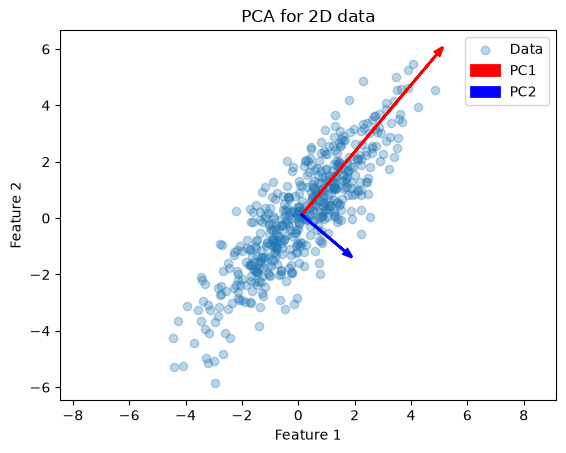
This example illustrates how PCA finds the two orthogonal directions (eigenvectors) along which the data vary most. Next, we apply PCA to the Iris dataset (4 features). First, we can inspect which features are most discriminative with a pairplot:
import seaborn as sns
from sklearn.datasets import load_iris

# Load Iris as a DataFrame for easy plotting
iris = load_iris(as_frame=True)
iris.frame["target"] = iris.target_names[iris.target]
sns.pairplot(iris.frame, hue="target");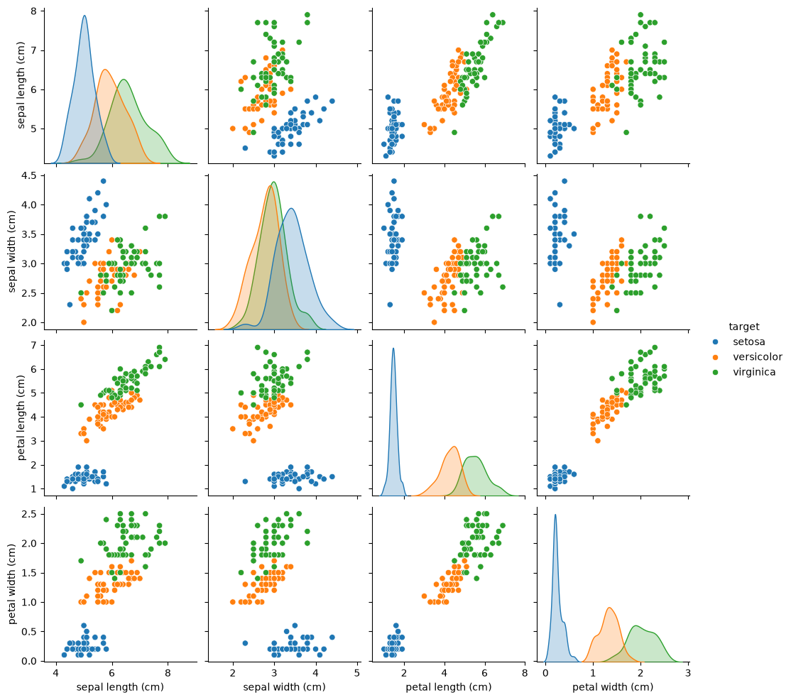
The pairplot shows petal length and petal width separate the three species most clearly.
from sklearn.decomposition import PCA

# Prepare data arrays
X, y = iris.data, iris.target
feature_names = iris.feature_names

# Fit PCA to retain first 3 principal components
pca = PCA(n_components=3).fit(X)

# Display feature-loadings and explained variance
print("Feature names:\n", feature_names)
print("\nPrincipal components (loadings):\n", pca.components_)
print("\nExplained variance ratio:\n", pca.explained_variance_ratio_)
Feature names:
['sepal length (cm)', 'sepal width (cm)', 'petal length (cm)', 'petal width (cm)']
Principal components (loadings):
[[ 0.36138659 -0.08452251 0.85667061 0.3582892 ]
[ 0.65658877 0.73016143 -0.17337266 -0.07548102]
[-0.58202985 0.59791083 0.07623608 0.54583143]]
Explained variance ratio:
[0.92461872 0.05306648 0.01710261]
pca.components_: each row is an eigenvector (unit length) showing how the four original features load onto each principal component.pca.explained_variance_ratio_: the fraction of total variance each component explains (e.g. PC1 ≈ 0.92, PC2 ≈ 0.05, PC3 ≈ 0.02).
Since PC1 explains over 92% of the variance, projecting onto it alone already captures most of the dataset’s structure.
Finally, we can project the data with the .transform(X) method. This does the following:
Centers
Xby subtracting each feature’s mean.Computes dot-products with the selected eigenvectors.
The resulting X_pca matrix has shape (n_samples, 3), giving the coordinates of each sample in the PCA subspace.
# Project (transform) the data into the first 3 PCs
X_pca = pca.transform(X)

# Plot
from mpl_toolkits.mplot3d import Axes3D
fig = plt.figure(figsize=(12, 4), constrained_layout=True)

ax1 = fig.add_subplot(1, 3, 1)
scatter1 = ax1.scatter(X_pca[:, 0], np.zeros_like(X_pca[:, 0]), c=y, cmap='viridis', s=40)
ax1.set(title='1 Component', xlabel='PC1')
ax1.get_yaxis().set_visible(False)

ax2 = fig.add_subplot(1, 3, 2)
ax2.scatter(X_pca[:, 0], X_pca[:, 1], c=y, cmap='viridis', s=40)
ax2.set(title='2 Components', xlabel='PC1', ylabel='PC2')

ax3 = fig.add_subplot(1, 3, 3, projection='3d', elev=-150, azim=110)
ax3.scatter(X_pca[:, 0], X_pca[:, 1], X_pca[:, 2], c=y, cmap='viridis', s=40)
ax3.set(title='3 Components', xlabel='PC1', ylabel='PC2', zlabel='PC3')

handles, labels = scatter1.legend_elements()
legend = ax1.legend(handles, iris.target_names, loc='upper left', title='Species')
ax1.add_artist(legend);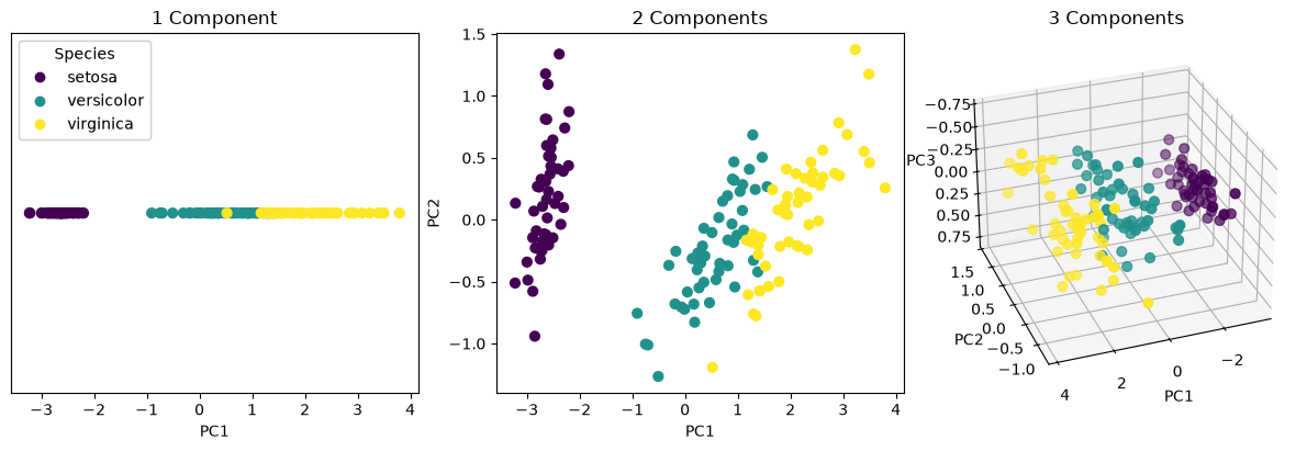
The 3D panel above is hard to read on a flat page, so here is the same projection as a figure you can rotate and zoom with the mouse. Spin it around and you will see that almost all of the separation lives along PC1:
Source
import plotly.graph_objects as go
import plotly.io as pio

tpl = pio.templates["plotly_white"]
tpl.layout.paper_bgcolor = "rgba(0,0,0,0)"
tpl.layout.plot_bgcolor = "rgba(128,128,128,0.08)"
tpl.layout.font.color = "#888888"
pio.templates["psy300"] = tpl
pio.templates.default = "psy300"

colours = ["#4c72b0", "#dd8452", "#55a868"]
evr = pca.explained_variance_ratio_

fig = go.Figure()
for k, name in enumerate(iris.target_names):
    mask = y == k
    fig.add_trace(go.Scatter3d(
        x=X_pca[mask, 0], y=X_pca[mask, 1], z=X_pca[mask, 2],
        mode="markers", name=name,
        marker=dict(size=4, color=colours[k], opacity=0.8),
    ))

fig.update_layout(
    scene=dict(
        xaxis_title=f"PC1 ({evr[0]:.1%})",
        yaxis_title=f"PC2 ({evr[1]:.1%})",
        zaxis_title=f"PC3 ({evr[2]:.1%})",
    ),
    margin=dict(l=0, r=0, t=30, b=0), height=520,
    title="Iris projected onto its first three principal components",
)
figPrincipal Component Regression
Previously introduced regularized regression models such as Ridge and Lasso address issues with correlated features or high-dimensional predictors by shrinking the regression coefficients. Another way to handle these issues is to transform the predictor space itself before regression. This leads to Principal Component Regression (PCR).
Principal Component Regression (PCR) first performs Principal Component Analysis (PCA) on the predictor matrix X. Then, it fits a linear regression model on the PCA-transformed data. This approach works well when directions of high variance in X are also predictive for y. However, since PCA is unsupervised, it may drop components that explain little variance but have high predictive power.
Let’s have another look at the simulated data from above.
Source
import numpy as np
import matplotlib.pyplot as plt
from sklearn.decomposition import PCA

# Simulate centered 2D data
rng = np.random.RandomState(0)
X = rng.multivariate_normal(mean=[0, 0], cov=[[3, 3], [3, 4]], size=500)

# Run PCA: extract eigenvectors and explained variance ratio
pca2d = PCA().fit(X)
pcs, scales = pca2d.components_, np.sqrt(pca2d.explained_variance_)

# Plot data
fig, ax = plt.subplots()
ax.scatter(X[:, 0], X[:, 1], alpha=0.3, label='Data')
mean = X.mean(axis=0)

# Plot PCs
ax.arrow(*mean, *(pcs[0] * scales[0] * 3), head_width=0.2, head_length=0.3, color='r', linewidth=2, label='PC1')
ax.arrow(*mean, *(pcs[1] * scales[1] * 3), head_width=0.2, head_length=0.3, color='b', linewidth=2, label='PC2')
ax.set(xlabel="Feature 1", ylabel="Feature 2", title="PCA for 2D data")
ax.axis('equal')
ax.legend();
For the purpose of this example, we now define the target to be aligned with low variance. This makes y strongly correlated with PC2 (the low variance direction):
y = X.dot(pca2d.components_[1]) + rng.normal(size=500) / 2

fig, ax = plt.subplots(1, 2, figsize=(10, 3))
ax[0].scatter(X.dot(pca2d.components_[0]), y, alpha=0.3)
ax[0].set(xlabel="Projection on PC1", ylabel="y", title="High-variance direction")
ax[1].scatter(X.dot(pca2d.components_[1]), y, alpha=0.3)
ax[1].set(xlabel="Projection on PC2", ylabel="y", title="Low-variance direction")
plt.tight_layout();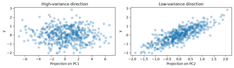
On this data, we can then perform PCR. Let’s first start with one component:
import numpy as np
import matplotlib.pyplot as plt

from sklearn.decomposition import PCA
from sklearn.pipeline import make_pipeline
from sklearn.preprocessing import StandardScaler
from sklearn.linear_model import LinearRegression
from sklearn.model_selection import train_test_split

X_train, X_test, y_train, y_test = train_test_split(X, y, random_state=rng)

pcr = make_pipeline(StandardScaler(), PCA(n_components=1), LinearRegression())
pcr.fit(X_train, y_train)

pca_step = pcr.named_steps["pca"]

fig, ax = plt.subplots()
ax.scatter(pca_step.transform(X_test), y_test, alpha=0.3, label="Ground truth")
ax.scatter(pca_step.transform(X_test), pcr.predict(X_test), alpha=0.3, label="PCR predictions")
ax.set(xlabel="First PCA component", ylabel="y", title="PCR (1 component)")
plt.legend()
plt.show()

print(f"PCR R²: {pcr.score(X_test, y_test):.3f}")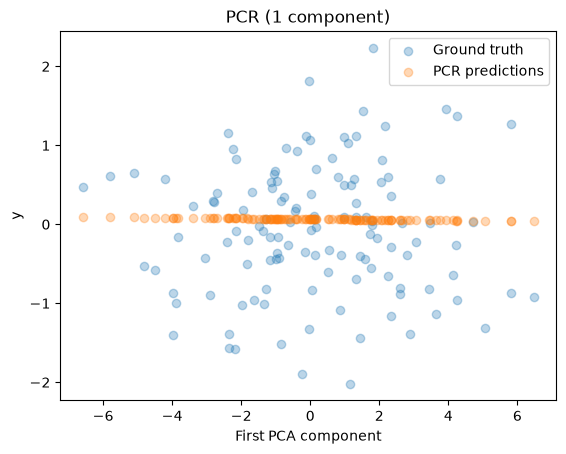
PCR R²: -0.026
Because PCA is unsupervised, it focuses on directions of high variance (PC1), even though PC2 contains most of the predictive signal. Hence, PCR performs poorly with one component. If we add a second component, we see that the PCR now captures the predictive direction (PC2) and performs much better:
pcr_2 = make_pipeline(StandardScaler(), PCA(n_components=2), LinearRegression())
pcr_2.fit(X_train, y_train)
print(f"PCR (2 components) R²: {pcr_2.score(X_test, y_test):.3f}")
PCR (2 components) R²: 0.673
Partial Least Squares Regression
While Principal Component Regression (PCR) reduces dimensionality by extracting directions that maximise variance in , Partial Least Squares Regression (PLS) incorporates information from the response variable .
PLS constructs latent components as linear combinations of the predictors such that each component has high covariance with the response while also capturing variation in . These components are extracted sequentially and used as predictors in a regression model.
Because PLS considers the relationship between and when defining components, it can identify predictive directions even when they correspond to relatively low variance in , a situation where PCR may fail.
Fitting a model is straightforward:
from sklearn.cross_decomposition import PLSRegression

pls = PLSRegression(n_components=1)
pls.fit(X_train, y_train)

fig, ax = plt.subplots()
ax.scatter(pls.transform(X_test), y_test, alpha=0.3, label="Ground truth")
ax.scatter(pls.transform(X_test), pls.predict(X_test), alpha=0.3, label="PLS predictions")
ax.set(xlabel="First PLS component", ylabel="y", title="PLS (1 component)")
plt.legend()
plt.show()

print(f"PLS R²: {pls.score(X_test, y_test):.3f}")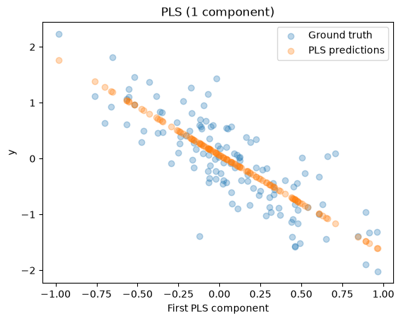
PLS R²: 0.658
You can see, even with a single component, PLS can align with the predictive direction because it uses target information. Thus, it achieves a high , unlike PCR with one component.