Support Vector Machines (SVMs) are supervised max-margin learning models used for classification and regression. In classification, they maximise the separation between classes, while in regression they learn a function that stays within an -insensitive margin around the data.
Let us consider some simulated classification data as an example:
import numpy as np
import matplotlib.pyplot as plt
import seaborn as sns
from scipy import stats
from matplotlib.lines import Line2D
from sklearn.datasets import make_classification
sns.set_theme(style="darkgrid")

X, y = make_classification(n_samples=50, n_features=2, n_informative=2, n_redundant=0,
                           n_clusters_per_class=1, class_sep=2.0, random_state=0)

fig, ax = plt.subplots()
sns.scatterplot(x=X[:, 0], y=X[:, 1], hue=y, s=60, ax=ax)
ax.set(xlabel="Feature 1", ylabel="Feature 2")

# Custom legend
legend_elements = [
    Line2D([0], [0], marker='o', linestyle='None', markersize=8, label='Class 0', markerfacecolor="#0173B2", markeredgecolor='None'),
    Line2D([0], [0], marker='o', linestyle='None', markersize=8, label='Class 1', markerfacecolor="#DE8F05", markeredgecolor='None')]
ax.legend(handles=legend_elements, loc="upper left", handlelength=1);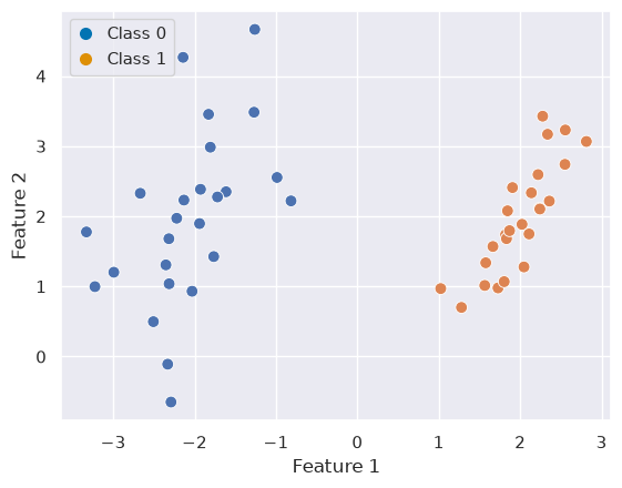
Quiz
Show visualisation
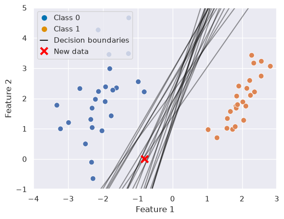
There are infinitely many ways to separate the two classes, because you can find an unlimited number of lines that separate them perfectly. If we visualise this and add a new data point for classification, a potential issue becomes apparent. For some models this data point would fall into Class 0, and for others into Class 1:
Support Vector Classifiers (SVC)
So evidently we cannot be satisfied with having infinitely many possible solutions — we need to come up with a more justifiable one. If you remember, we already did so for linear regression: there, the least squares method chose the line that minimised the total squared distance between predictions and true values.
Support Vector Classifiers have a slightly different method. As Robert Tibshirani put it, they are
An approach to the classification problem in a way computer scientists would approach it.
Rather than minimising a squared error, they aim to find the hyperplane that maximises the margin, which is the distance between the separating hyperplane and the closest data points from each class. The idea is that by maximising this margin, we obtain a decision boundary that is both robust and generalisable.
A little glossary for SVMs:
Hyperplane: A decision boundary that separates classes. In p dimensions, it is a p−1 dimensional subspace, given by the equation: . So in the case of two predictors the hyperplane is one dimensional (a line).
Margin: The (perpendicular) distance between the hyperplane and the closest training points. A maximal margin classifier chooses the hyperplane that maximises this margin.
Support Vectors: Observations closest to the decision boundary. They define the margin and the classifier.
Soft Margin: A method used when the data is not linearly separable. Allows some observations to violate the margin. Controlled via the hyperparameter .
Kernel Trick: Implicitly maps data into a higher-dimensional space to make it linearly separable using functions like polynomial or RBF (Gaussian) kernels.
To formalise this intuition, SVCs look for the maximum margin classifier — a hyperplane that not only separates the classes but does so with the greatest possible distance to the closest training samples. These closest samples are known as support vectors, and they uniquely determine the position of the hyperplane. All other samples can be moved without changing the decision boundary, making SVCs especially robust to outliers away from the margin.
Using SVCs
As you learned in the lecture, SVCs are considered to be one of the best “out of the box” classifiers and can be used in many scenarios. This includes:
When the number of features is large relative to the number of samples
When classes are not linearly separable
When a robust and generalisable classifier is needed
If the data is not perfectly separable (either because the classes overlap, or the classes are not linearly separable) SVCs can become creative in two ways as they can:
“Soften” what is meant by separating the classes and allow for errors
Map feature space into a higher dimension (kernel trick)
Example 1: Linear Classification
Fitting an SVC is straightforward:
from sklearn.svm import SVC

clf = SVC(kernel='linear')
clf.fit(X, y);
With a little helper function we can visualize the decision function and supports:
Source
def plot_svc_decision_function(model, ax=None):
    """Plot the decision boundary and margins for a trained 2D SVC model."""
    # Set up grid
    xlim = ax.get_xlim()
    ylim = ax.get_ylim()
    xx, yy = np.meshgrid(np.linspace(*xlim, 100), np.linspace(*ylim, 100))
    grid = np.c_[xx.ravel(), yy.ravel()]
    decision_values = model.decision_function(grid).reshape(xx.shape)

    # Plot decision boundary and margins
    ax.contour(xx, yy, decision_values, levels=[-1, 0, 1], linestyles=['--', '-', '--'], colors='k', alpha=0.5)

    # Support vectors
    ax.scatter(*model.support_vectors_.T, s=200, linewidth=0.5, facecolors='none', edgecolors='k')

fig, ax = plt.subplots()
sns.scatterplot(x=X[:, 0], y=X[:, 1], hue=y, s=60, ax=ax)
ax.set(xlabel="Feature 1", ylabel="Feature 2", xlim=(-5,3))
plot_svc_decision_function(clf, ax=ax)

# Custom legend
legend_elements = [
    Line2D([0], [0], marker='o', linestyle='None', markersize=8, label='Class 0', markerfacecolor="#0173B2", markeredgecolor='None'),
    Line2D([0], [0], marker='o', linestyle='None', markersize=8, label='Class 1', markerfacecolor="#DE8F05", markeredgecolor='None'),
    Line2D([0], [0], color='k', linestyle='-', label='Decision boundary'),
    Line2D([0], [0], color='k', linestyle='--', label='Decision margins'),
    Line2D([0], [0], marker='o', color='k', markersize=8, label='Support vectors', markerfacecolor='None', linestyle='None')]
ax.legend(handles=legend_elements, loc="upper left", handlelength=1);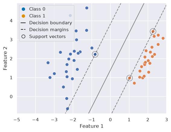
Example 2: Nonlinear Classification
Let’s consider different data, which is not linearly separable:
from sklearn.datasets import make_circles
X, y = make_circles(100, factor=.1, noise=.15)

fig, ax = plt.subplots()
sns.scatterplot(x=X[:, 0], y=X[:, 1], hue=y, s=60, ax=ax)
ax.set(xlabel="Feature 1", ylabel="Feature 2")

# Custom legend
legend_elements = [
    Line2D([0], [0], marker='o', linestyle='None', markersize=8, label='Class 0', markerfacecolor="#0173B2", markeredgecolor='None'),
    Line2D([0], [0], marker='o', linestyle='None', markersize=8, label='Class 1', markerfacecolor="#DE8F05", markeredgecolor='None')]
ax.legend(handles=legend_elements, loc="upper left", handlelength=1);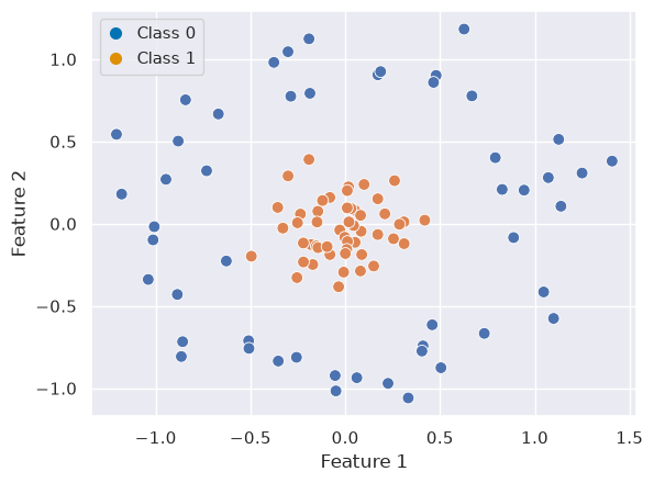
In that case, non-linear SVC can be applied. For example, a simple projection would be a radial basis function centered on the middle clump. As you can see, the data becomes linearly separable in three dimensions:
from mpl_toolkits import mplot3d

# Apply radial basis function to the feature space
r = np.exp(-(X ** 2).sum(1))

# Plot features in 3D
fig = plt.figure()
ax = fig.add_subplot(projection='3d')

colors = np.array(["#0173B2", "#DE8F05"])[y] # colors for each class
ax.scatter(X[:, 0], X[:, 1], r, c=colors, s=50, alpha=0.5, edgecolors=colors)
ax.view_init(elev=20, azim=30)
ax.set(xlabel='x', ylabel='y', zlabel='r');

# Custom legend
legend_elements = [
    Line2D([0], [0], marker='o', linestyle='None', markersize=8, label='Class 0', markerfacecolor="#0173B2", markeredgecolor='None'),
    Line2D([0], [0], marker='o', linestyle='None', markersize=8, label='Class 1', markerfacecolor="#DE8F05", markeredgecolor='None')]
ax.legend(handles=legend_elements, loc="upper left", handlelength=1);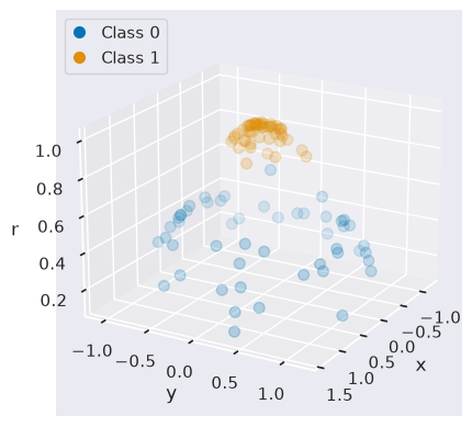
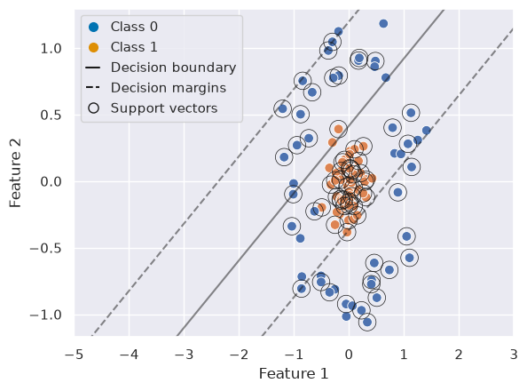
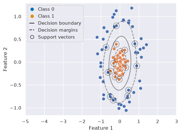
We can create a similar plot as above, first with a linear SVC and second with a RBF SVC to visualize the decision boundary, margins, and support vectors:
from sklearn.model_selection import train_test_split
from sklearn.metrics import classification_report

X_train, X_test, y_train, y_test = train_test_split(X, y, test_size=0.3)

# Linear SVC
clf_lin = SVC(kernel='linear')
clf_lin.fit(X_train, y_train)

y_pred = clf_lin.predict(X_test)
print("Linear SVC classification report:\n", classification_report(y_test, y_pred))

# Plot
fig, ax = plt.subplots()
sns.scatterplot(x=X[:, 0], y=X[:, 1], hue=y, s=60, ax=ax)
ax.set(xlabel="Feature 1", ylabel="Feature 2", xlim=(-5,3))
plot_svc_decision_function(clf_lin, ax=ax)

# Custom legend
legend_elements = [
    Line2D([0], [0], marker='o', linestyle='None', markersize=8, label='Class 0', markerfacecolor="#0173B2", markeredgecolor='None'),
    Line2D([0], [0], marker='o', linestyle='None', markersize=8, label='Class 1', markerfacecolor="#DE8F05", markeredgecolor='None'),
    Line2D([0], [0], color='k', linestyle='-', label='Decision boundary'),
    Line2D([0], [0], color='k', linestyle='--', label='Decision margins'),
    Line2D([0], [0], marker='o', color='k', markersize=8, label='Support vectors', markerfacecolor='None', linestyle='None')]
ax.legend(handles=legend_elements, loc="upper left", handlelength=1);
Linear SVC classification report:
precision recall f1-score support
0 0.83 0.33 0.48 15
1 0.58 0.93 0.72 15
accuracy 0.63 30
macro avg 0.71 0.63 0.60 30
weighted avg 0.71 0.63 0.60 30
# RBF SVC
clf_rbf = SVC(kernel='rbf')
clf_rbf.fit(X_train, y_train)

y_pred = clf_rbf.predict(X_test)
print("RBF SVC classification report:\n", classification_report(y_test, y_pred))

# Plot
fig, ax = plt.subplots()
sns.scatterplot(x=X[:, 0], y=X[:, 1], hue=y, s=60, ax=ax)
ax.set(xlabel="Feature 1", ylabel="Feature 2", xlim=(-5,3))
plot_svc_decision_function(clf_rbf, ax=ax)

# Custom legend
legend_elements = [
    Line2D([0], [0], marker='o', linestyle='None', markersize=8, label='Class 0', markerfacecolor="#0173B2", markeredgecolor='None'),
    Line2D([0], [0], marker='o', linestyle='None', markersize=8, label='Class 1', markerfacecolor="#DE8F05", markeredgecolor='None'),
    Line2D([0], [0], color='k', linestyle='-', label='Decision boundary'),
    Line2D([0], [0], color='k', linestyle='--', label='Decision margins'),
    Line2D([0], [0], marker='o', color='k', markersize=8, label='Support vectors', markerfacecolor='None', linestyle='None')]
ax.legend(handles=legend_elements, loc="upper left", handlelength=1);
RBF SVC classification report:
precision recall f1-score support
0 1.00 1.00 1.00 15
1 1.00 1.00 1.00 15
accuracy 1.00 30
macro avg 1.00 1.00 1.00 30
weighted avg 1.00 1.00 1.00 30
Multiclass Classification
SVCs are inherently binary classifiers but can be extended:
One-vs-One: classifiers for each pair of classes.
One-vs-All: K classifiers, each comparing one class against the rest.
In sklearn you can, for example, use the ovo decision function for one-vs-one classification:
from sklearn.datasets import make_blobs

# Generate data
X, y = make_blobs(n_samples=150, centers=3, random_state=42, cluster_std=5)
X_train, X_test, y_train, y_test = train_test_split(X, y, stratify=y, random_state=42)

# Plot
fig, ax = plt.subplots()
sns.scatterplot(x=X[:, 0], y=X[:, 1], hue=y, palette='deep', ax=ax, s=60)
ax.set(xlabel="Feature 1", ylabel="Feature 2", title="Multiclass SVC")

legend_elements = [
    Line2D([0], [0], marker='o', linestyle='None', markersize=8, label='Class 0', markerfacecolor="#0173B2", markeredgecolor='None'),
    Line2D([0], [0], marker='o', linestyle='None', markersize=8, label='Class 1', markerfacecolor="#DE8F05", markeredgecolor='None'),
    Line2D([0], [0], marker='o', linestyle='None', markersize=8, label='Class 2', markerfacecolor="#029E73", markeredgecolor='None')]
ax.legend(handles=legend_elements, loc="upper left", handlelength=1);
plt.show()

# Multiclass prediction
clf = SVC(kernel='rbf', decision_function_shape='ovo')
clf.fit(X_train, y_train)

y_pred = clf.predict(X_test)
print("Multiclass classification report:\n", classification_report(y_test, y_pred))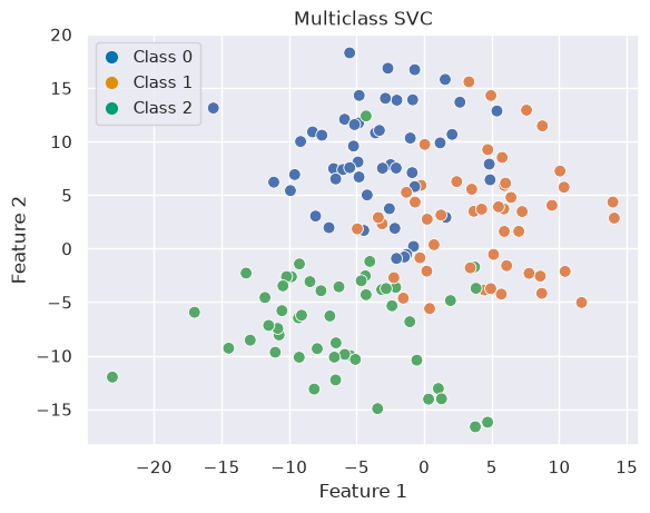
Multiclass classification report:
               precision    recall  f1-score   support

           0       0.78      0.58      0.67        12
           1       0.65      0.85      0.73        13
           2       1.00      0.92      0.96        13

    accuracy                           0.79        38
   macro avg       0.81      0.78      0.79        38
weighted avg       0.81      0.79      0.79        38
Choosing Hyperparameters
SVCs have a few hyperparameters. Please have a look at the documentation for a more in-depth overview. For the SVC used in the previous examples, the most important ones are:
C: Regularisation parameter; trade-off between margin width and classification error.kernel:'linear','poly','rbf','sigmoid', or custom.gamma: Kernel coefficient (for RBF, polynomial, and sigmoid kernels)
```{warning} C is inverted compared to the lecture
In sklearn (and usually also MATLAB and R) C behaves inversely to what you were shown in the lecture. Small values of C will result in a wider margin, at the cost of misclassifications (high bias, low variance). Large values of C will give you a smaller margin and fit the training data more tightly (low bias, higher variance).
As always, hyperparameters should be tuned using [cross-validation](../1_basics/3_resampling.md) to balance bias and variance. It often makes sense to use a [grid search](https://scikit-learn.org/stable/modules/grid_search.html) or related strategies to find the optimal solution:


```{code-cell} ipython3
:tags: [hide-input]
import pandas as pd
from sklearn.model_selection import GridSearchCV

# Generate data
X, y = make_circles(100, factor=.1, noise=.3)
X_train, X_test, y_train, y_test = train_test_split(X, y, stratify=y, random_state=0)

# Grid search
C_vals = np.logspace(-3, 3, 30)     # 0.001 to 1000
gamma_vals = np.logspace(-3, 1, 30) # 0.001 to 10
param_grid = {'C': C_vals, 'kernel': ['rbf'], 'gamma': gamma_vals}

grid = GridSearchCV(SVC(), param_grid, cv=5)
grid.fit(X_train, y_train)

# Results
print("Best parameters:", grid.best_params_)
print("Best cross-validation score:", grid.best_score_)
print("Test set score:", grid.score(X_test, y_test))

# Plot heatmap
results = pd.DataFrame(grid.cv_results_)
scores_matrix = results.pivot(index='param_gamma', columns='param_C', values='mean_test_score') # Pivot table to make a matrix of mean test scores

fig, ax = plt.subplots()
sns.heatmap(
    scores_matrix,
    cmap="viridis",
    xticklabels=False,
    yticklabels=False,
    ax=ax)

# Plot custom ticks
n_ticks = 10 # plot n ticks
xticks = np.linspace(0, len(scores_matrix.columns) - 1, n_ticks, dtype=int)
yticks = np.linspace(0, len(scores_matrix.index) - 1, n_ticks, dtype=int)

xticklabels = [f"{scores_matrix.columns[i]:.3g}" for i in xticks]
yticklabels = [f"{scores_matrix.index[i]:.3g}" for i in yticks]

ax.set(xticks=xticks, yticks=yticks, yticklabels=yticklabels, title="Mean CV Accuracy")
ax.set_xticklabels(xticklabels, rotation=45);
Interactive: what do C and gamma actually do?
The heatmap tells you which combination scored best, but not why. Below you can set both hyperparameters by hand and see the decision boundary they produce. Move C and gamma around and try to reproduce the two classic failure modes: a boundary so smooth it ignores the structure, and a boundary so wiggly it wraps around individual points.
Source
import numpy as np
import plotly.graph_objects as go
import plotly.io as pio

tpl = pio.templates["plotly_white"]
tpl.layout.paper_bgcolor = "rgba(0,0,0,0)"
tpl.layout.plot_bgcolor = "rgba(128,128,128,0.08)"
tpl.layout.font.color = "#888888"
pio.templates["psy300"] = tpl
pio.templates.default = "psy300"

C_grid = [0.1, 1, 10, 100]
gamma_grid = [0.1, 1, 10, 100]

# Self-contained data so this cell does not depend on earlier chapter state
Xi, yi = make_circles(200, factor=.3, noise=.18, random_state=0)
Xi_train, Xi_test, yi_train, yi_test = train_test_split(
    Xi, yi, stratify=yi, random_state=0)

xx, yy = np.meshgrid(np.linspace(Xi[:, 0].min() - 0.4, Xi[:, 0].max() + 0.4, 160),
                     np.linspace(Xi[:, 1].min() - 0.4, Xi[:, 1].max() + 0.4, 160))
mesh = np.c_[xx.ravel(), yy.ravel()]

surfaces, captions = [], []
for C in C_grid:
    for g in gamma_grid:
        model = SVC(kernel="rbf", C=C, gamma=g).fit(Xi_train, yi_train)
        Z = model.decision_function(mesh).reshape(xx.shape)
        surfaces.append(go.Contour(
            x=xx[0], y=yy[:, 0], z=Z, visible=False, showscale=False,
            # Alpha is baked into the colorscale so the midpoint stays
            # see-through in both the light and the dark version of the site
            colorscale=[[0.0, "rgba(1,115,178,0.55)"],
                        [0.5, "rgba(128,128,128,0.04)"],
                        [1.0, "rgba(222,143,5,0.55)"]],
            contours=dict(start=-3, end=3, size=0.25),
            line=dict(width=0),
        ))
        captions.append(
            f"C = {C:g},  gamma = {g:g}   |   "
            f"support vectors = {len(model.support_)}/{len(Xi_train)}   |   "
            f"train acc = {model.score(Xi_train, yi_train):.2f}   |   "
            f"test acc = {model.score(Xi_test, yi_test):.2f}"
        )
# Start on a sensible middle setting (C = 1, gamma = 1) rather than an extreme
start = C_grid.index(1) * len(gamma_grid) + gamma_grid.index(1)
surfaces[start].visible = True

points = go.Scatter(
    x=Xi[:, 0], y=Xi[:, 1], mode="markers", name="data", showlegend=False,
    marker=dict(size=8, color=np.where(yi == 0, "#0173B2", "#DE8F05"),
                line=dict(width=1, color="white")),
)

slider_steps = []
for i, cap in enumerate(captions):
    vis = [False] * len(surfaces) + [True]
    vis[i] = True
    C, g = C_grid[i // len(gamma_grid)], gamma_grid[i % len(gamma_grid)]
    slider_steps.append(dict(
        method="update", label=f"{C:g}/{g:g}",
        args=[{"visible": vis},
              {"annotations": [dict(x=0.5, y=1.12, xref="paper", yref="paper",
                                    text=cap, showarrow=False,
                                    font=dict(size=12), xanchor="center")]}]))

fig = go.Figure(data=surfaces + [points])
fig.update_layout(
    sliders=[dict(active=start, pad={"t": 50}, steps=slider_steps,
                  font=dict(size=10),
                  currentvalue={"prefix": "C / gamma = "})],
    annotations=[dict(x=0.5, y=1.12, xref="paper", yref="paper", text=captions[start],
                      showarrow=False, font=dict(size=12), xanchor="center")],
    xaxis_title="Feature 1", yaxis_title="Feature 2",
    margin=dict(l=10, r=10, t=80, b=20), height=560,
)
figWhat to look for:
Small
gammamakes each support vector influence a wide region, so the boundary is nearly straight. Largegammashrinks that influence to a tiny neighbourhood, and the model starts drawing islands around individual training points — memorisation, not learning.Small
Ctolerates margin violations and yields a wide, smooth margin. LargeCinsists on classifying every training point correctly, at the cost of a contorted boundary.The support vector count is a useful diagnostic in its own right: a model that needs nearly every training point as a support vector has not compressed the data into anything general.
References
This chapter was inspired by the Python Data Science Handbook notebook. I encourage you to give it a read for more information and a cool example on facial recognition!